Primum
Align the body
scroll
Logo Design
Art Direction
Photography
Verbal Identity
Brand Activation
The brand
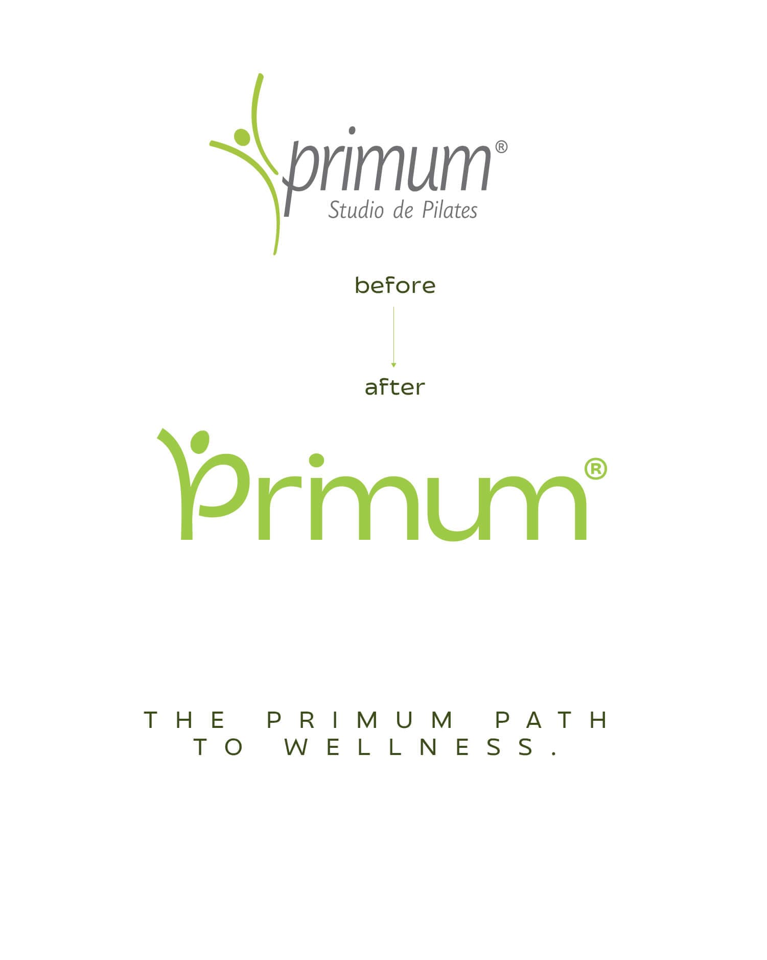
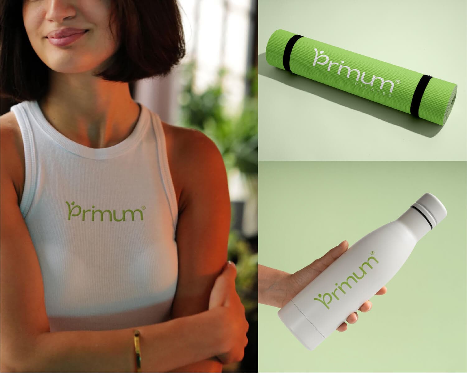
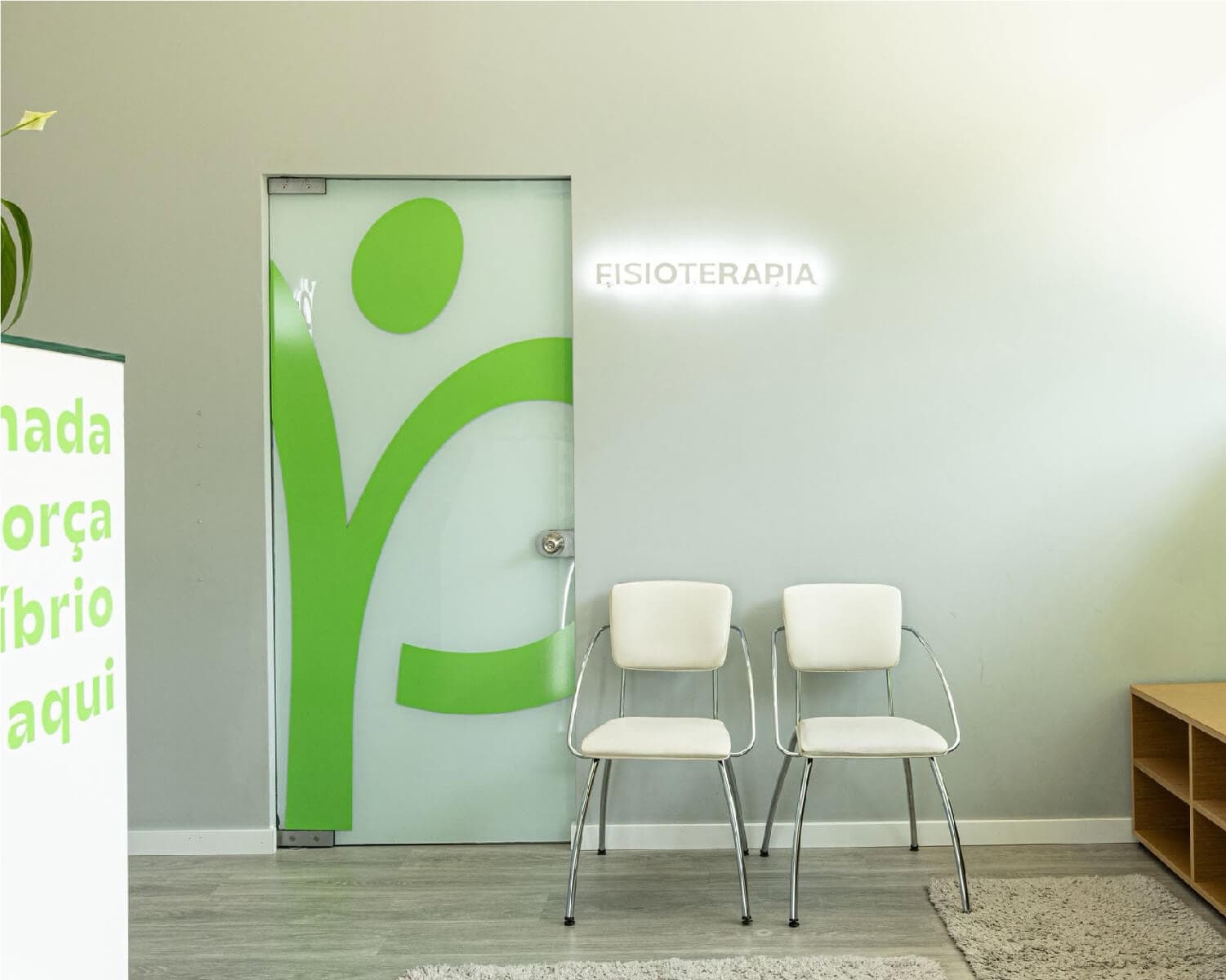
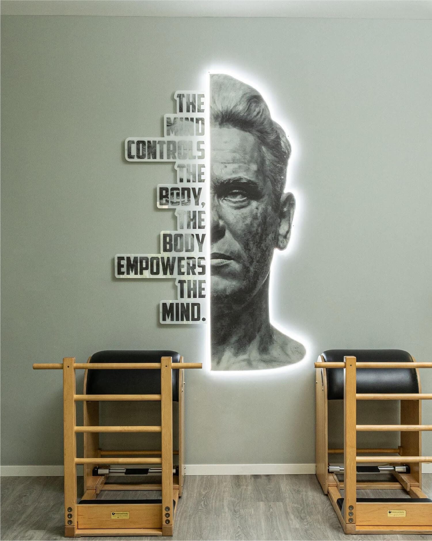
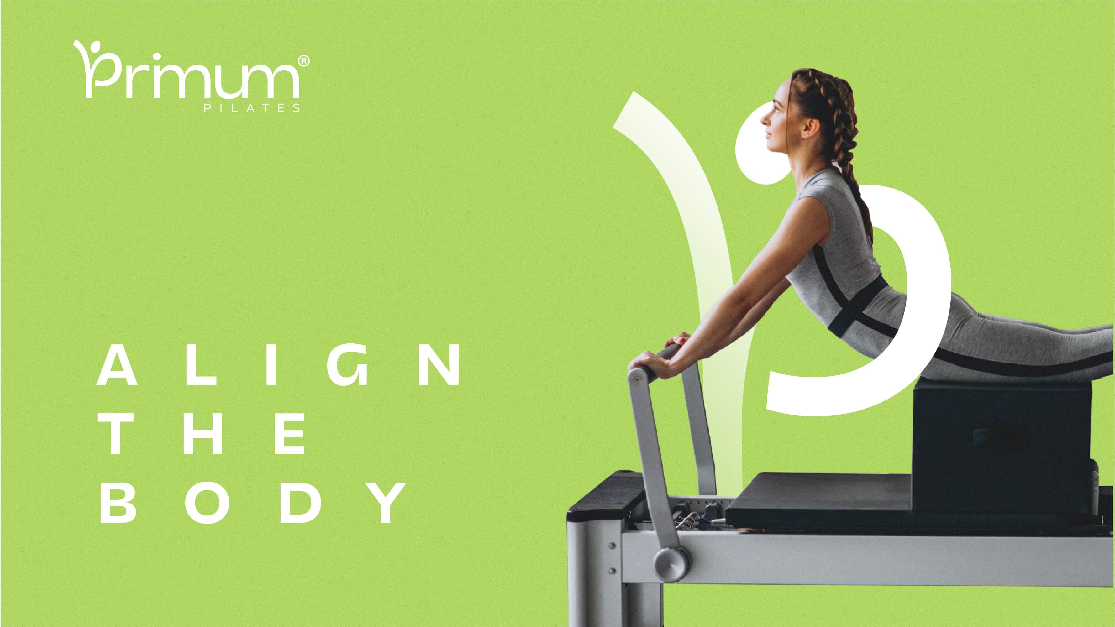
Primum Pilates needed an image to match its ambition: bolder, more current, and truly commercial. We started with a fragmented logo — a disconnected icon and text, scattered colours — and arrived at a single, cohesive wordmark. The character now merges with the letter P, becoming an integral part of the brand, while the letters i, m and u connect visually through their "legs," shortening the word without compromising legibility. The result is a cleaner identity built around one dominant colour, ready to expand into physical space through window displays, interior signage and light signage — becoming, in itself, part of the space's experience.