Visopoli
keep it cold.

Logo Design
Visual Identity
Verbal Identity
Brand Activation
The brand
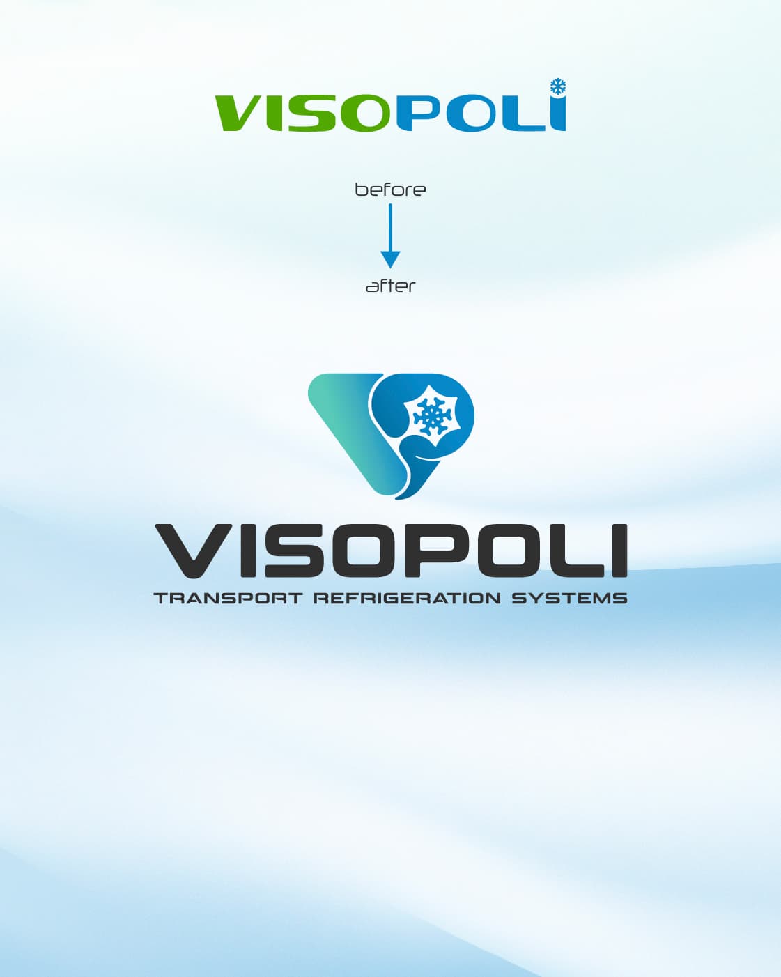
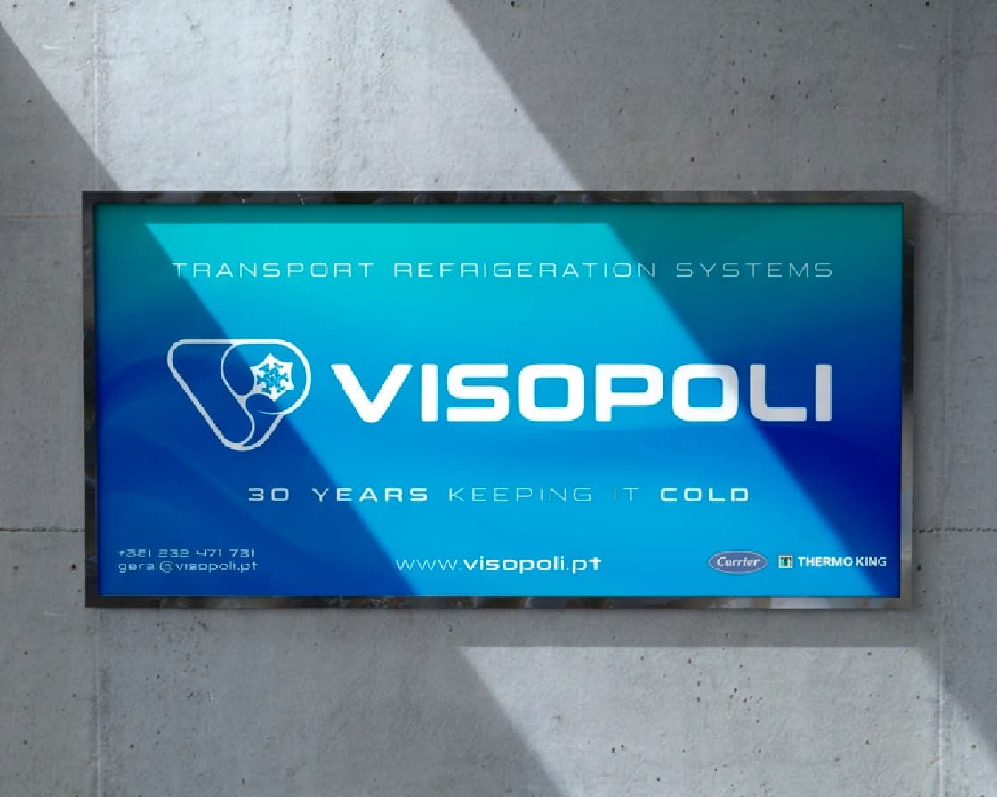
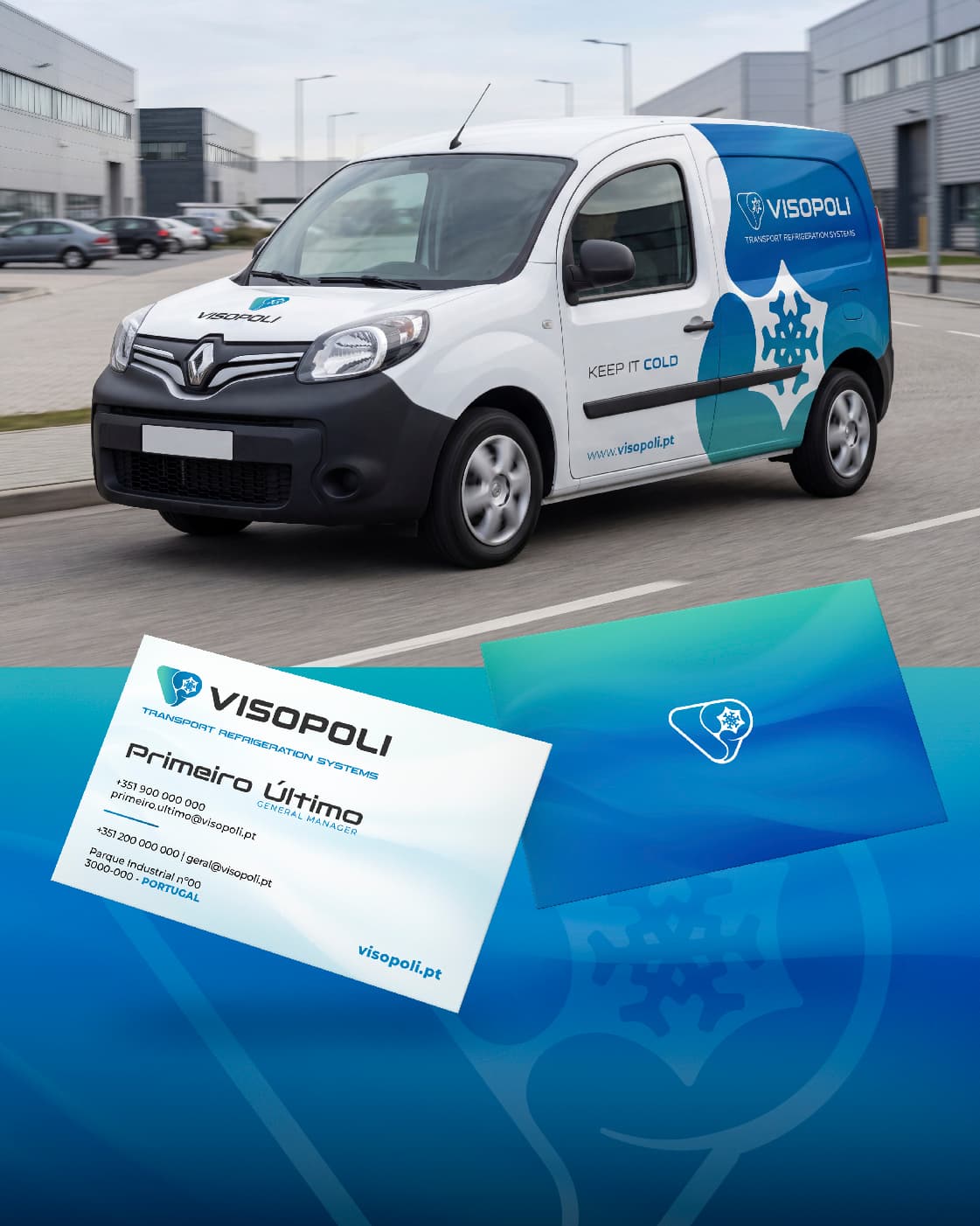
After a first rebrand built around a two-colour wordmark — green and blue, with the classic snowflake replacing the tip of the "i" — Visopoli felt that version captured their identity better than the current one, even though it was functional. The challenge wasn't to go backwards, but to move forward. So we brought together the elements that had always represented the brand — the V, the P and the snowflake — into a single icon, merging their two classic colours into one gradient. More than an aesthetic choice, this gradient visually translates the brand's core business: transforming commercial vehicles into refrigerated ones, keeping everything cold for higher-quality delivery. An identity now extended to the fleet itself, through vehicle decoration — reinforcing, mile after mile, the promise to keep it cold.